Branding

Ascend RCM

AscendRCM approached us to create a distinctive logo that embodies efficiency, trust, and innovation in revenue cycle management. Our mission was to craft a versatile and professional identity that clearly communicates expertise while staying sleek and modern.

Design Brief

Streamlining Revenue Management with Confidence

AscendRCM tasked us with crafting a striking, versatile logo that radiates accuracy, trust, and cutting-edge performance for finance and healthcare.

Concept Development

Precision Meets Modern Design

 Our design team translated AscendRCM’s values into a minimalist “A” monogram infused with subtle financial and digital motifs. Sharp lines and geometric forms communicate accuracy and innovation, while smart use of negative space adds sophistication.
This contemporary and memorable logo reflects AscendRCM’s commitment to efficient, dependable revenue cycle management, reinforcing their reputation as a trusted partner.

Typography and Colors

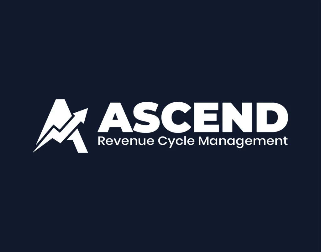
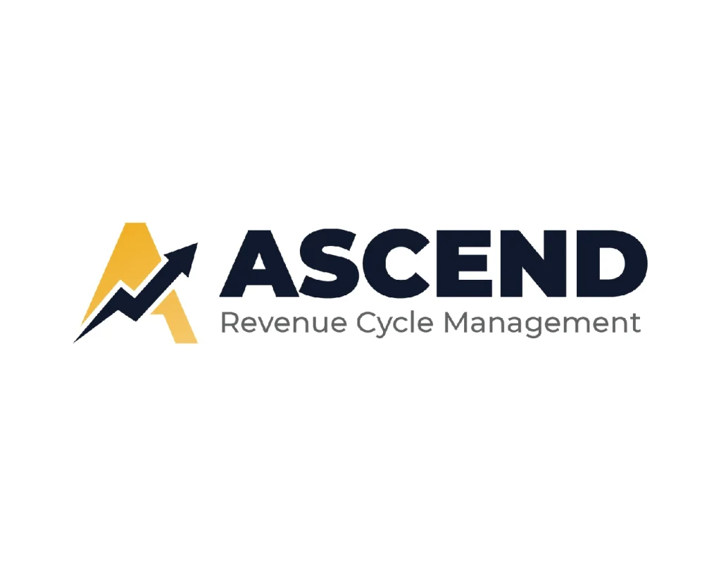
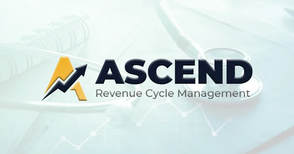
A Strong, Professional Visual Identity

AscendRCM’s logo combines clean, bold typography for professionalism with a secondary font that ensures clarity and readability across digital and print platforms. The color palette features a vibrant gold (#EEB42F) symbolizing success and growth, paired with a deep navy (#11182B) representing trust and stability. Together, these choices create a visually striking and cohesive identity for AscendRCM.

#eeb42f

#11182b

Primary Font

Roboto

Aa, Bb, Cc, Dd, Ee, Ff, Gg, Hh, Ii, Jj, Kk, Ll, Mm, Nn, Oo, Pp, Qq, Rr, Ss, Tt, Uu, Vv, Ww, Xx, Yy, Zz

What Our Users Say

I am very impressed with Crypthon Technologies’ work. They delivered a modern, professional logo that truly represents our brand and has boosted our visibility and credibility. Highly recommended.

Let’s Get Started

This Could Be the Start of Something Incredible!

A transparent budget will help us ensure expectations are met. Not sure? Ballparks are fine.